


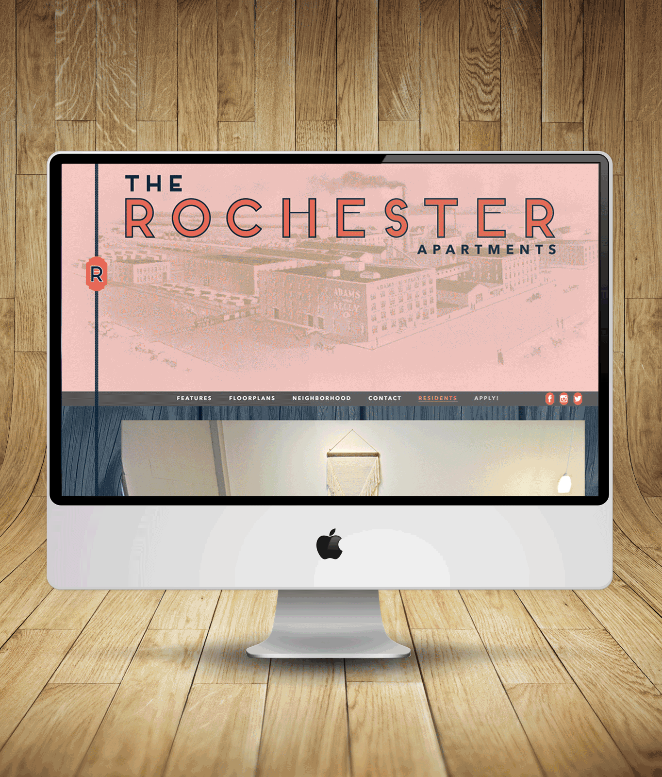
The Rochester
Visual ID System for a 1920s Warehouse Redevelopment
SOLUTION:
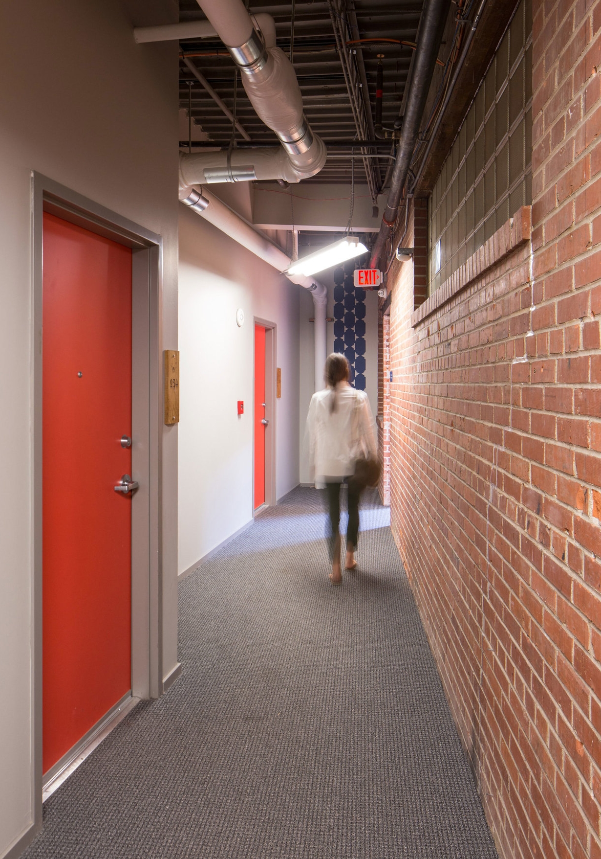
The Rochester's brand was developed around a collection of artisans and tradespeople that historically inhabited the building and surrounding district.
A hand-drawn icon system reinforces each floorplan, named after the selected trades, throughout the building. Reclaimed wood was laser-etched to easily indicate both unit numbering and corresponding floorplan. This additional layer of discovery delights and guides residents through the property.
Hand-painted detailing fortifies the brand throughout the interior and exterior. The art package consists of custom pieces printed digitally, then manually installed onto wooden boards: deconstructed, then re-constructed. The leasing office, resident corridors, and street view also feature hand-painted brand reinforcement.


ROLES
identity development | art direction | wayfinding package design | art package design + production | exterior signage | web design | resident experience
LINKS
Developer | Architect | Leasing | MTRL | Joe Swec | Miguel McCrary | Juri Zaech