The Wire Apartments
Branding for Omaha's Northwestern Bell building, which housed America's switchboard for all toll-free-numbers from the 1950s through the eighties.
SOLUTION:
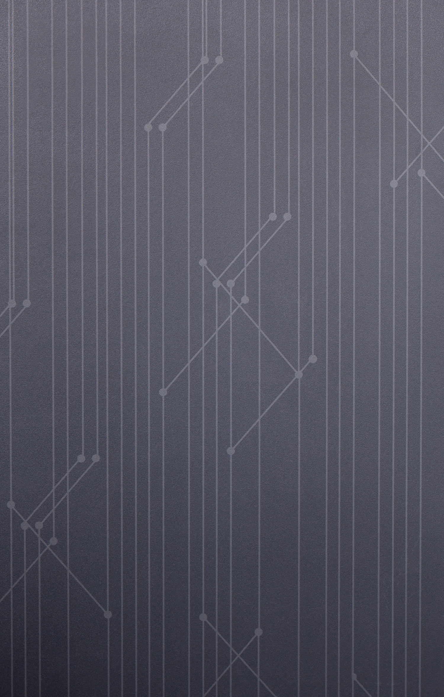
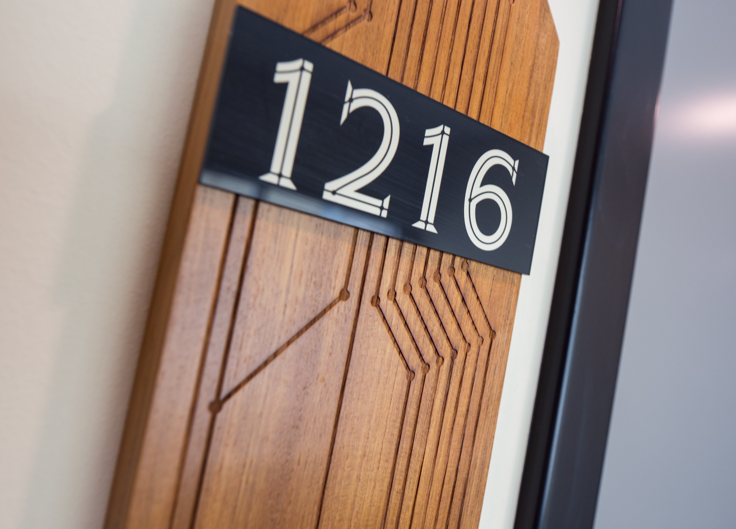
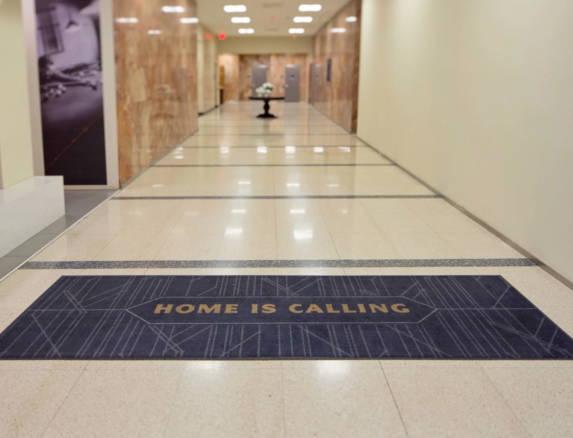
When the owners of this building secured it, and an intern suggested the name, The Wire has become a celebration of how we have communicated through the last century. In an effort to abstractly represent the concept of communication, the brand features a repeating node pattern- utilized in the custom wallpaper, laser-etched teak unit signs, way-finding signage and traffic rugs.
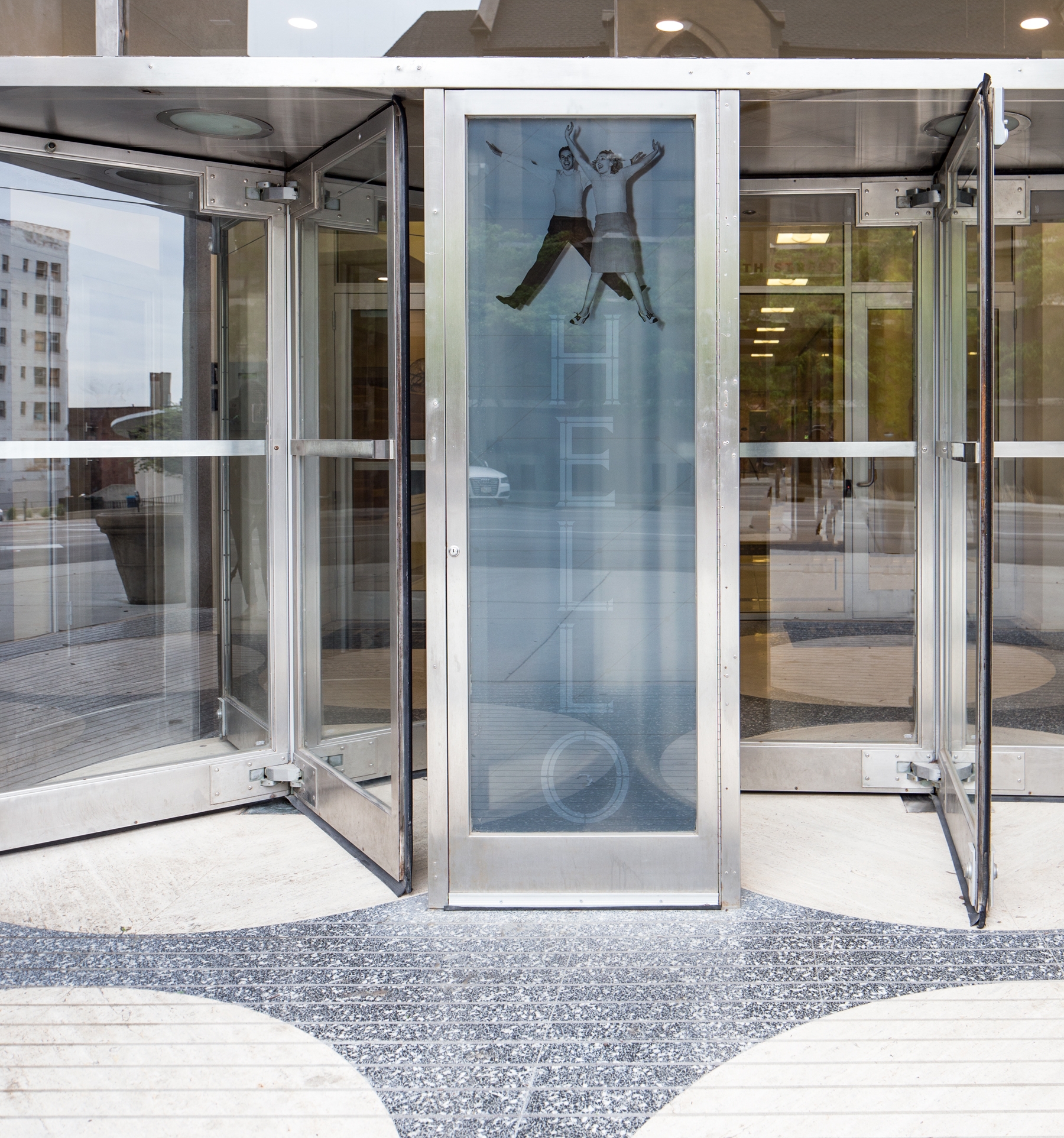
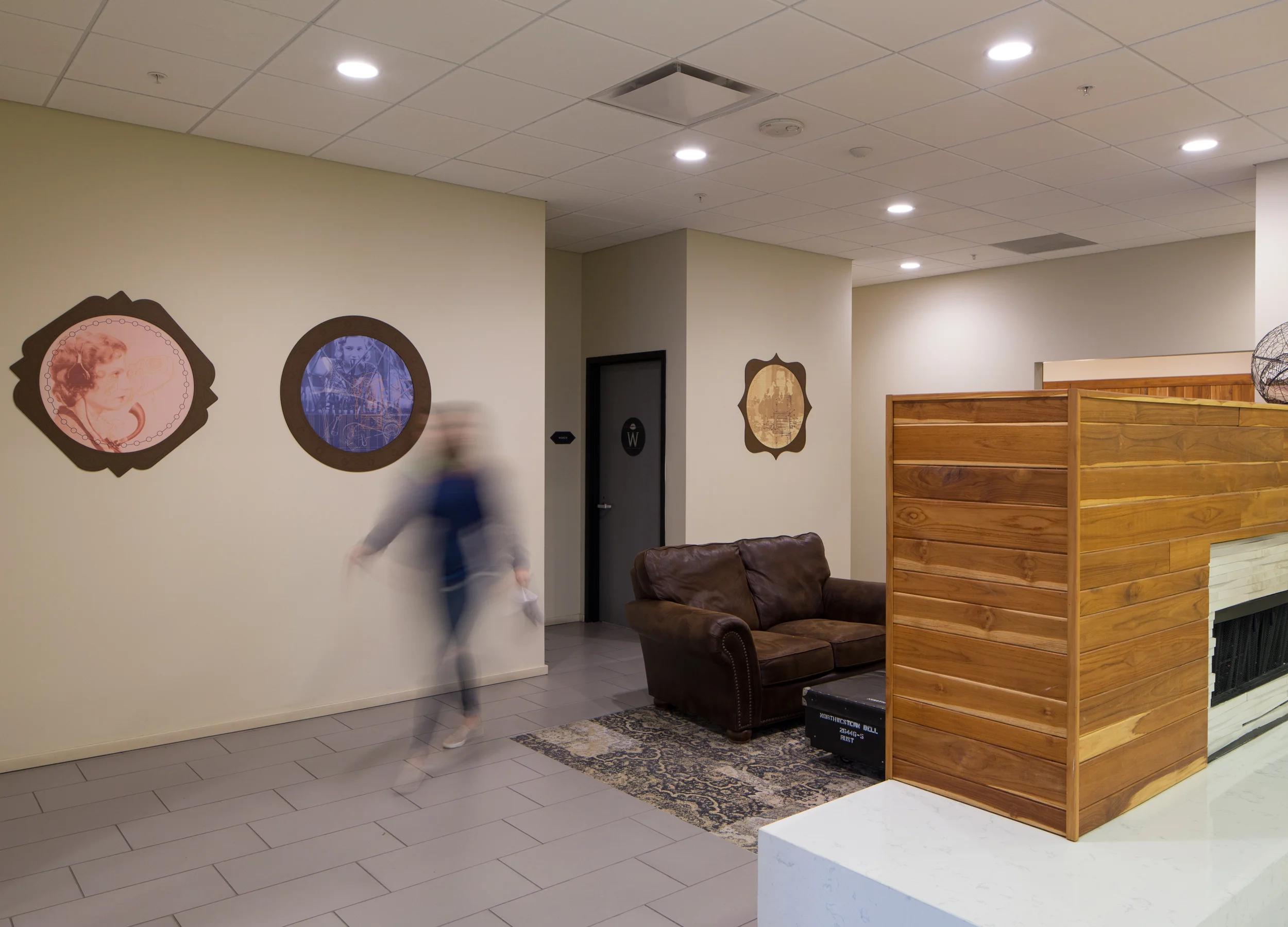
The Wire's entrance plays host to four original phone booths, now clad with branded overlays. The art collection was created using vintage invention drawings, photographs of precursors to the telephone- and switchboards much like what were originally installed in The Wire.
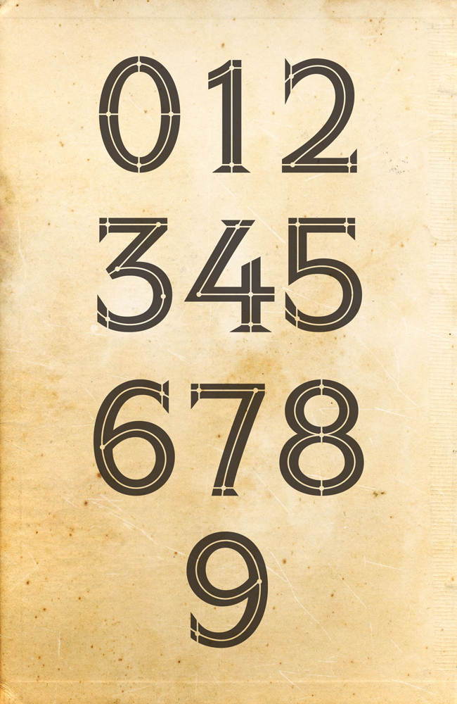
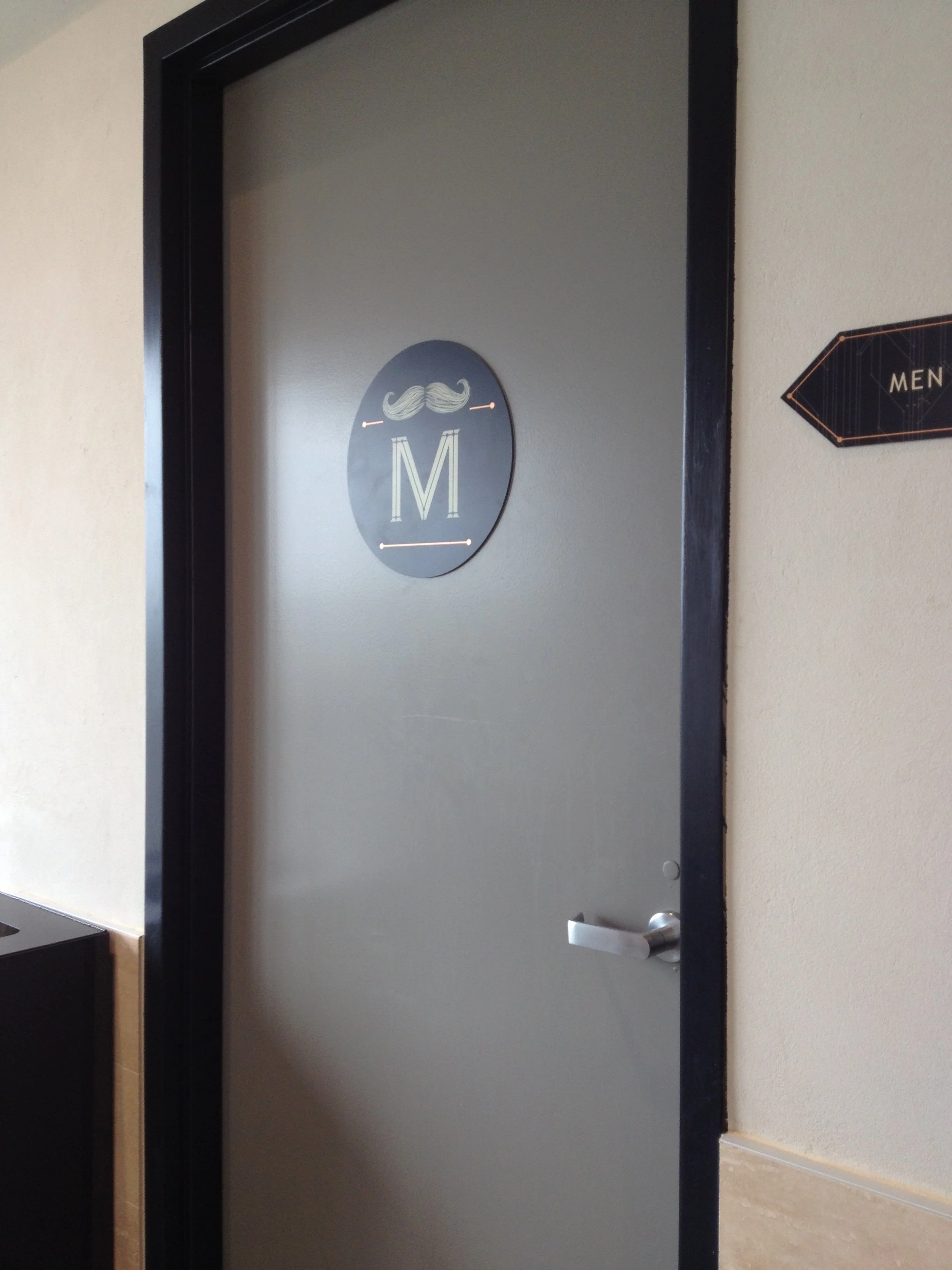
We also got the opportunity with this project to build a custom typeface and number system, based on ITC Symbol Bold, used throughout the building's signage package, awarded with ASI’s national 'BEST OF' distinction. Copper-toned metallic effects highlight patterning throughout the signage package.
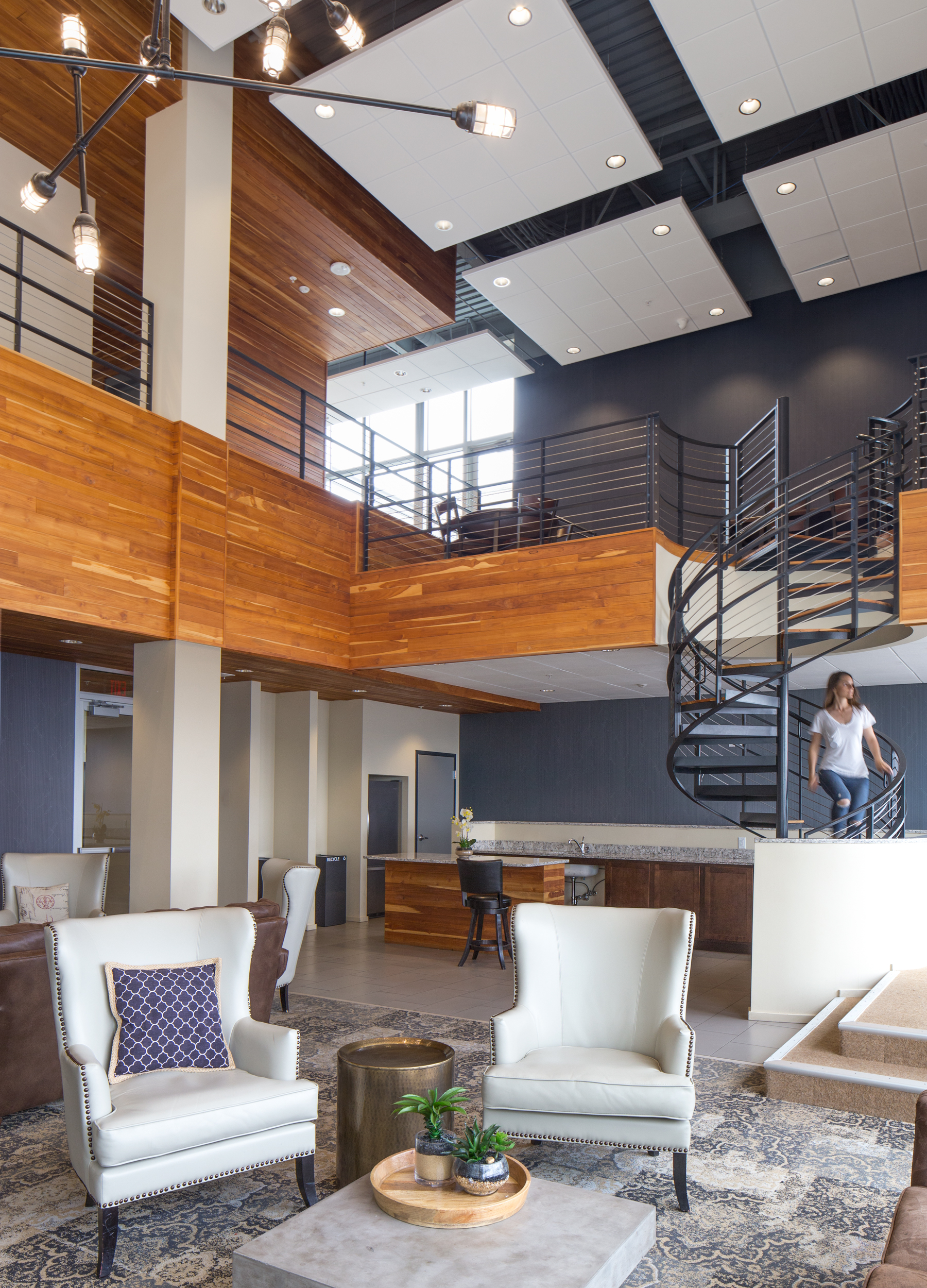
This project presented fabrication opportunities involving power tools, countless copper nails and yards and yards of copper wire- resulting in a unique leasing office sign featuring the building's tagline. The entire rooftop floors of The Wire have been designated as community spaces; from the elevator lobby, residents and guests are directed to three distinct areas: ‘Waterworks’, ‘Wireworks’, and ‘Lounge’.
ROLES
copy + identity development | art direction | wayfinding signage package | interior art package | exterior signage | web design | resident experience | signage production
LINKS
Developer | Architect | Leasing | Custom Framing | Signage Production


